10 WooCommerce My Account Page Design Examples
Design patterns that make the WooCommerce My Account page feel modern: card layouts, dashboards, order tracking, and dark mode.
Most WooCommerce My Account pages look the same because most stores never touch the default markup - a plain list of links, a table with no hierarchy, forms styled by whatever the theme happens to do. The stores that stand out share a small set of recognizable patterns. Here's what separates them, with real screens as the working example.
What separates a good My Account design from a default one
Five things, in rough order of impact:
- Scannability - can a customer find what they need in under two seconds, or do they have to read every row?
- Mobile-first tables - does the order/download list actually work on a phone, or is it a desktop table shrunk down? (See our CSS recipe for fixing this specifically.)
- Status visibility - is an order's status obvious at a glance (color, badge, icon) or buried in a text column?
- Navigation speed - does clicking between tabs feel instant, or does every click reload the page?
- Brand consistency - does the account area look like part of the same store, or like a different piece of software bolted on?
Pattern 1: card-based order history instead of plain tables
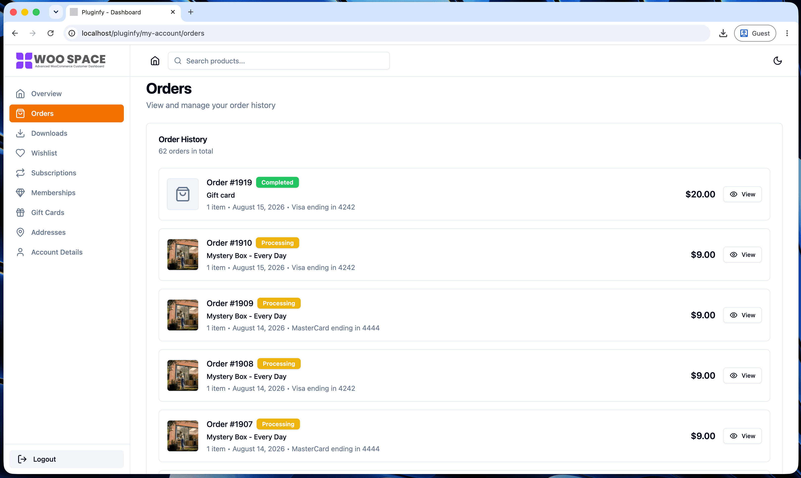
A <table> with eight columns doesn't scale to mobile and buries the one
thing customers actually look for (status) among things they don't
(payment method, in most cases). Cards let each order lead with status
and total, with details available on tap/click instead of always visible.
Pattern 2: a dashboard summary on the landing tab
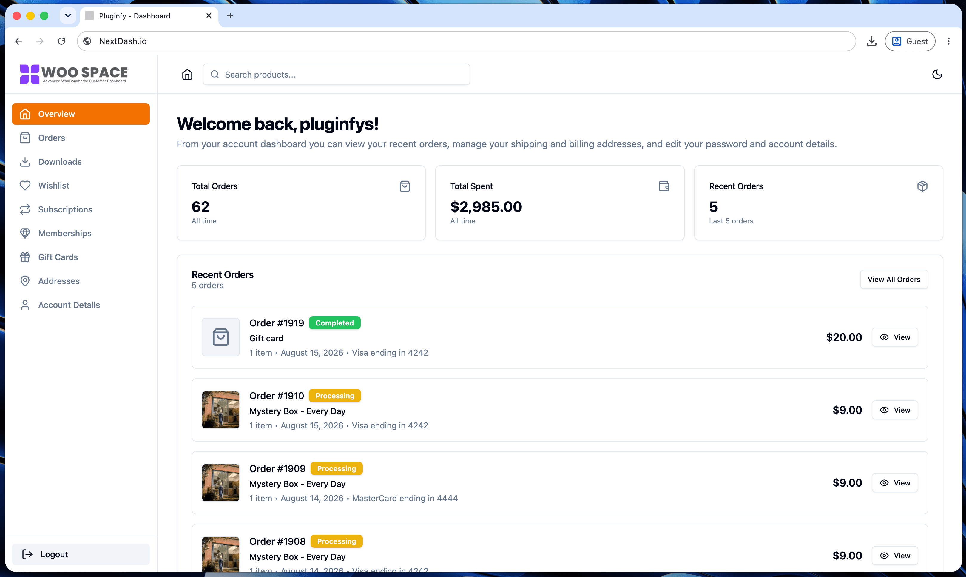
The default My Account page's first screen is usually just a greeting and a list of links - no actual information. A dashboard pattern surfaces the things a returning customer wants immediately: recent orders, account stats, quick links to the sections used most, all above the fold. It turns the landing tab into something worth looking at instead of a page to click past.
Pattern 3: sidebar navigation with icons vs top tabs
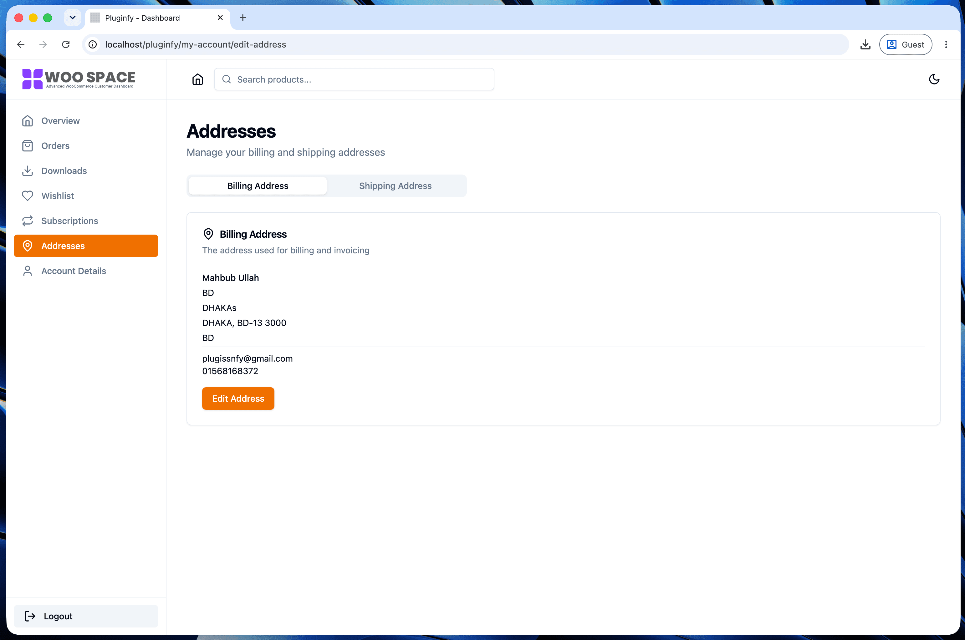
Icon-labeled sidebar navigation (visible in the cover screenshot above) scans faster than a row of text-only tabs, especially once a store has more than four or five sections - subscriptions, memberships, gift cards, and bookings on top of the WooCommerce defaults. Icons give the eye a second way to locate a section besides reading every label.
Pattern 4: inline order tracking / status timeline
Rather than making a customer open a shipping carrier's site to check where an order is, a status timeline (placed → processing → shipped → delivered) inline on the order detail view answers the single most common "where is my order" question without a support ticket. This is one of the biggest wins for support load specifically - see our guide to reducing My Account support tickets for the broader pattern of surfacing information instead of making customers ask for it.
Pattern 5: dark mode as a first-class option
Dark mode done well isn't a CSS filter slapped on top - it's a second set
of design tokens (background, text, border colors) that every screen
respects, switchable by system preference or a manual toggle. Our CSS
guide
covers building a prefers-color-scheme-based version yourself if you
want to implement this pattern without a plugin.
How NextDash implements these by default
All five patterns above are what NextDash's dashboard renders out of the box, not something layered on afterward: card-based orders and downloads, a real dashboard summary as the landing tab, icon sidebar navigation, order status visibility throughout, and light/dark/system theme modes. You can see all of it live on the demo site rather than just screenshots.
FAQ
Do I need a plugin to implement these patterns? No - patterns 1, 3, and 5 are achievable with CSS alone (see our CSS styling guide). Pattern 2 (a real dashboard summary) and pattern 4 (order tracking timelines) typically need PHP to pull in the extra data, since CSS can only restyle what's already rendered.
Which pattern has the biggest impact on support tickets? Order status visibility (patterns 1 and 4 together) - "where is my order" is consistently the most common My Account-related support question, and both patterns address it directly on the page instead of requiring a message to support.
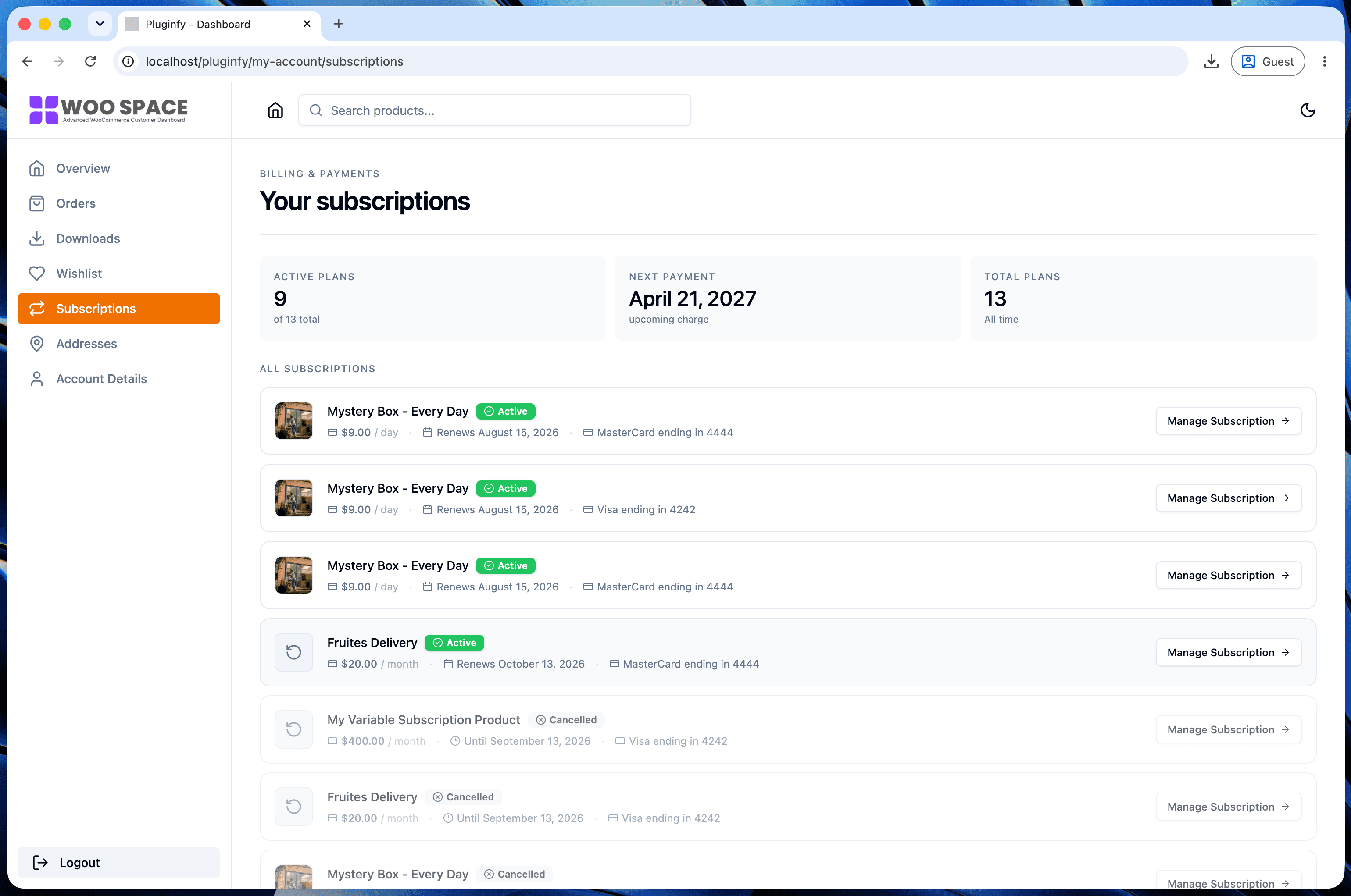
Is card-based design better for every store? For orders and downloads, almost always - the information genuinely fits better as cards than as wide tables. For dense data a customer wants to scan many rows of at once (a long subscription history, for example), a well-designed table can still be the right call.
Skip the custom code — install NextDash
NextDash replaces the default WooCommerce My Account page with a modern React dashboard out of the box: order management, downloads, addresses, dark mode, and fast client-side navigation, no template overrides required.