WooCommerce My Account Mobile UX: Mistakes and Fixes
Why the WooCommerce My Account page performs worse on mobile, and practical fixes for tables, navigation, forms, and speed.
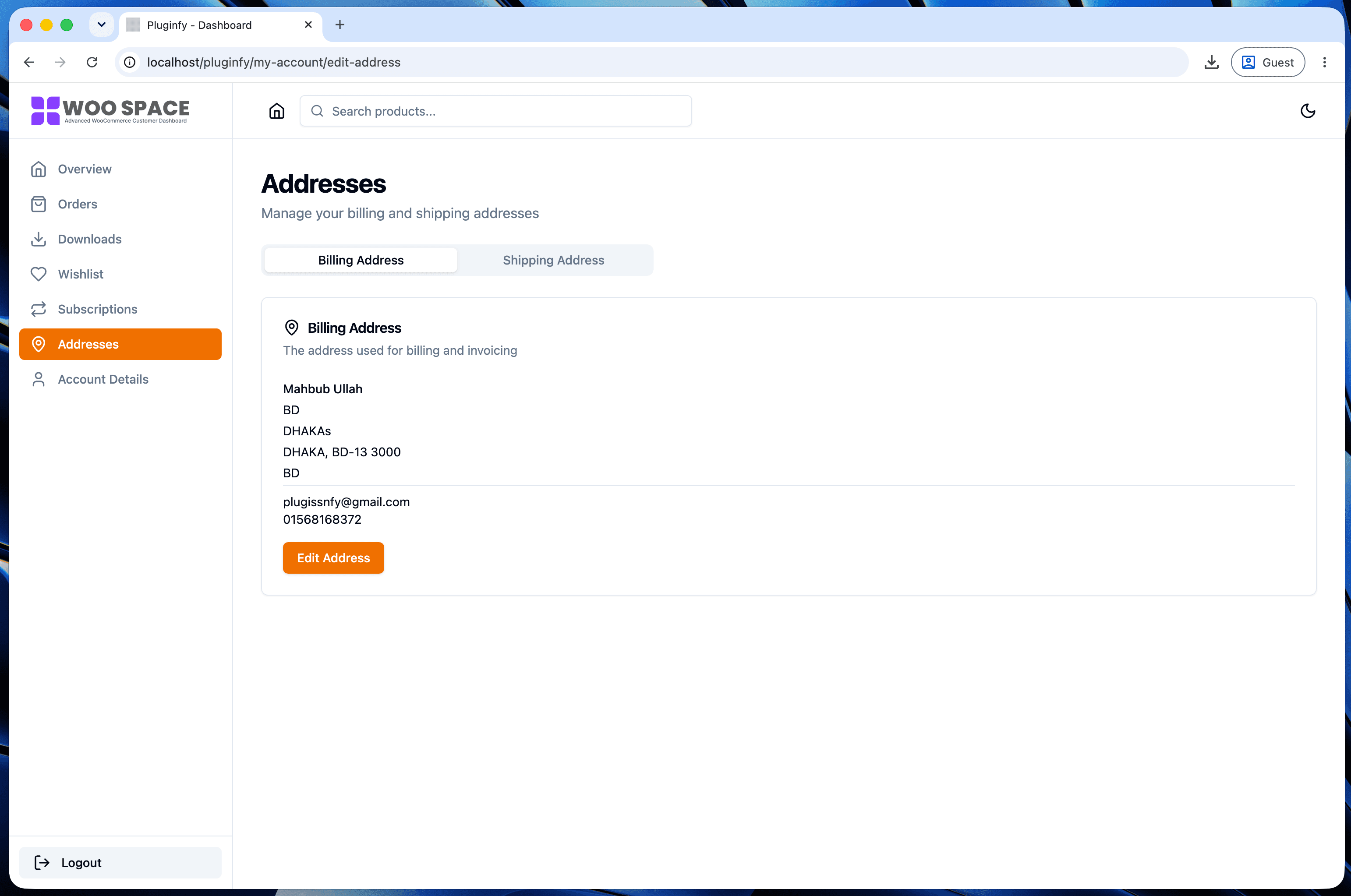
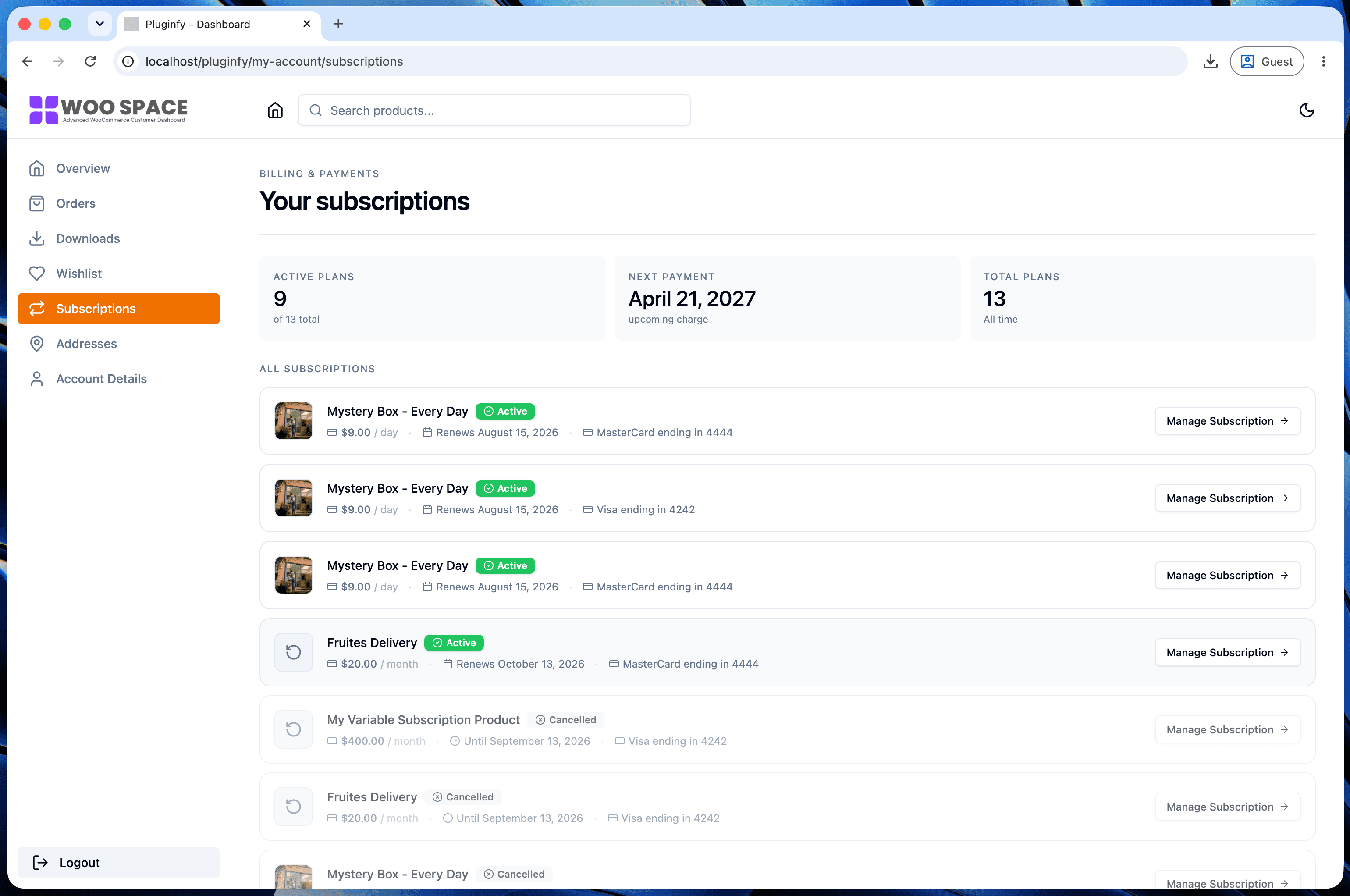
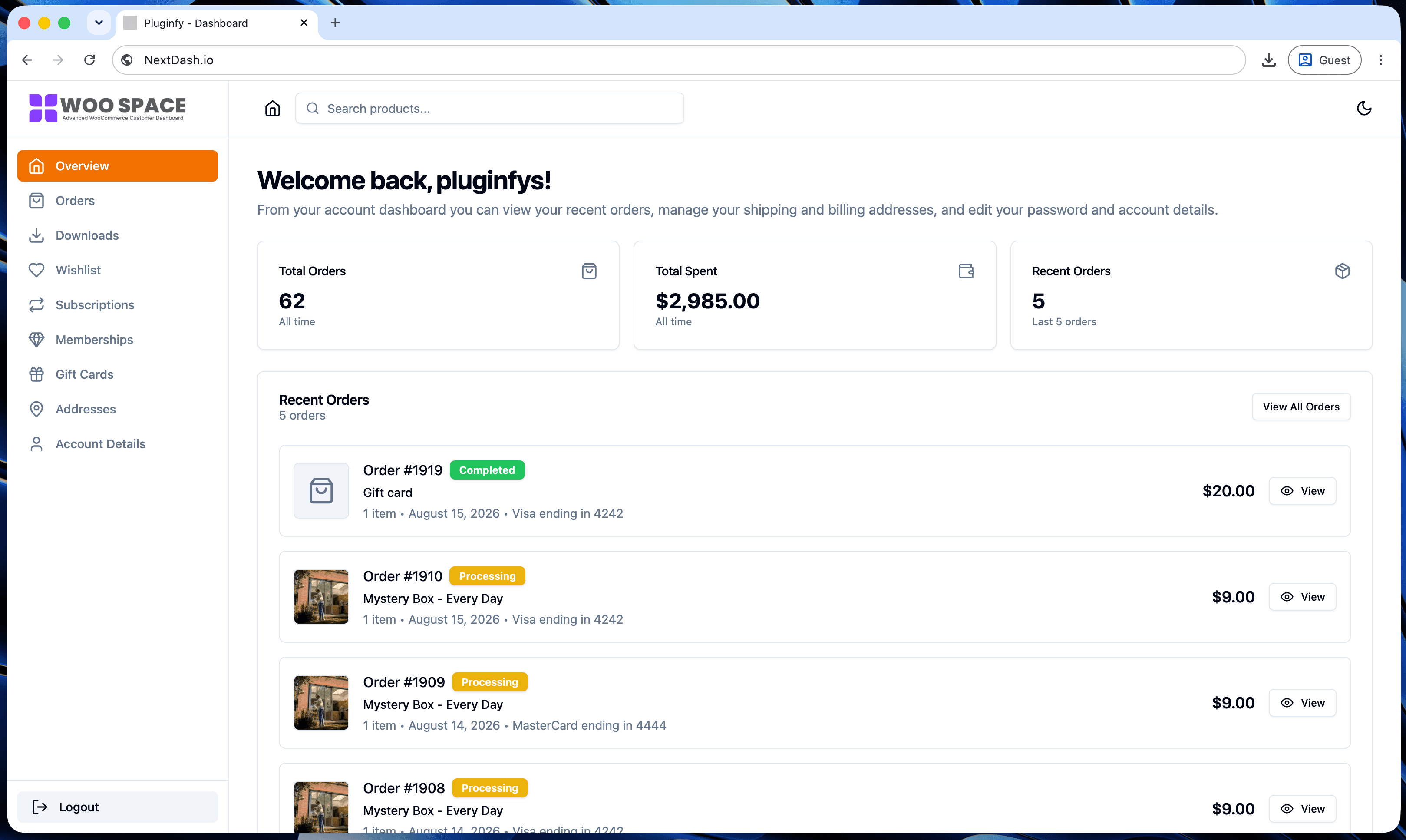
My Account gets disproportionately mobile-heavy traffic compared to the rest of a WooCommerce store - customers checking order status from their phone, often right after a shipping notification arrives there. A page that's merely "responsive" on paper but awkward in practice loses exactly the visits it should be winning.
Why My Account skews mobile
The trigger for a My Account visit is frequently a phone notification - a shipping update, a payment confirmation, a subscription renewal reminder - and customers check it from whatever device that notification arrived on. That's disproportionately mobile compared to browsing or checkout, which happen more evenly across devices. If the account page degrades on mobile, it's degrading for the visits most likely to happen there in the first place.
Mistake 1: desktop tables squeezed into mobile width
A <table> designed for a desktop screen doesn't reflow gracefully -
it either forces horizontal scrolling or shrinks every column until tap
targets become too small to hit reliably. Fix: collapse the table
into stacked cards below a breakpoint, using each cell's data-title
attribute - see the exact recipe in our CSS styling
guide.
Mistake 2: navigation that pushes content below the fold
A full-width navigation menu at the top of the page, common in default themes, can push actual account content out of the initial mobile viewport entirely - a customer has to scroll past navigation just to see anything useful. Fix: a compact or collapsible navigation pattern on mobile specifically (a horizontal scroll strip or a menu toggle) that prioritizes content over chrome.
Mistake 3: form fields not optimized for mobile keyboards
Address and account-detail forms often use plain <input type="text">
for everything, missing inputmode and autocomplete attributes that
tell mobile keyboards what to show. A phone number field without
inputmode="tel" shows a full QWERTY keyboard instead of a numeric pad;
an address field without autocomplete="street-address" misses
browser-assisted autofill entirely. Fix:
<input type="tel" inputmode="tel" autocomplete="tel" />
<input type="text" autocomplete="postal-code" inputmode="numeric" />
<input type="email" inputmode="email" autocomplete="email" />
Small attributes, meaningful difference in how much typing a mobile customer actually has to do.
Mistake 4: full page reloads feeling especially slow on mobile
The reload-per-tab cost covered in our My Account speed post hits harder on mobile networks, where round-trip latency is higher and bandwidth is more variable than a desktop wired or fast wifi connection. The same 1-2 second reload on desktop can stretch noticeably longer on mobile data. Fix: the same underlying fix as the speed post - reducing what reloads per navigation, or moving to client-side routing that doesn't reload at all.
How to test properly
Resizing a desktop browser window is not a mobile test - it misses touch target sizing, real mobile keyboard behavior, and actual network conditions. Test with:
- A real device, not just responsive mode in browser DevTools
- A throttled network (Chrome DevTools has a "Slow 4G" preset) to simulate realistic mobile conditions rather than testing on office wifi
- Actual thumb taps, not mouse clicks, to catch tap targets that are technically clickable but awkward to hit reliably
FAQ
Is mobile traffic really higher on My Account than on other pages? It varies by store, but the "checking a phone notification" pattern described above makes it a reasonable default assumption worth verifying in your own analytics rather than dismissing.
Do these fixes require a plugin, or can I implement them with just CSS/HTML changes? Mistakes 1-3 are addressable with CSS and HTML attribute changes alone, no plugin needed. Mistake 4 (the reload cost) is architectural - fixing it fully requires either significant custom work or a dashboard built with client-side routing from the start, since it's not a styling-level problem.
Does NextDash address all four of these by default? Yes - mobile-first layout, non-squeezed tables, and client-side routing are default behavior rather than opt-in settings, since the dashboard is designed mobile-first rather than adapted from a desktop layout afterward.
Skip the custom code — install NextDash
NextDash replaces the default WooCommerce My Account page with a modern React dashboard out of the box: order management, downloads, addresses, dark mode, and fast client-side navigation, no template overrides required.