How to Style the WooCommerce My Account Page With CSS
Copy-paste CSS recipes to redesign the WooCommerce My Account page: card navigation, mobile order tables, dark mode, and more.
Not every My Account redesign needs PHP. If what you want is visual - a different navigation style, better-looking tables, a form that matches your brand - CSS gets you there without touching a single hook, and it survives every WooCommerce update since you're not modifying any files WooCommerce owns.
Where to put custom CSS
Two good options, in order of preference:
- Appearance → Customize → Additional CSS - built into WordPress, no file editing, changes apply immediately in the customizer preview. Best for most stores.
- A child theme's
style.css- better if you're already maintaining a child theme and want your styles version-controlled alongside the rest of your theme code.
Either way, avoid editing your parent theme's stylesheet directly - a theme update will silently overwrite it.
The key selectors
WooCommerce applies a consistent set of classes across every My Account screen, so learning these four covers most of what you'll want to style:
| Selector | What it targets |
|---|---|
.woocommerce-MyAccount-navigation | The tab navigation menu |
.woocommerce-MyAccount-content | The content area for the active tab |
.woocommerce-orders-table | The orders list table |
.woocommerce-Address | Address cards on the Addresses tab |
Recipe: rounded card navigation with an active-tab highlight
.woocommerce-MyAccount-navigation ul {
  border-radius: 0.75rem;
  overflow: hidden;
  border: 1px solid #e5e7eb;
}

.woocommerce-MyAccount-navigation-link a {
  display: block;
  padding: 0.75rem 1rem;
  transition: background-color 0.15s ease;
}

.woocommerce-MyAccount-navigation-link.is-active a {
  background: #7c3aed;
  color: #fff;
  font-weight: 600;
}
This is the same pattern from our customization guide - CSS-only here since we're not touching markup, just presentation.
Recipe: turning the plain orders table into card rows on mobile
WooCommerce's orders table is a <table>, which is exactly the wrong
element for narrow screens. A common fix is collapsing it into stacked
cards below a breakpoint using each cell's existing data-title
attribute (WooCommerce adds these automatically for accessibility, which
conveniently makes this trick possible without touching markup):
@media (max-width: 640px) {
  .woocommerce-orders-table thead {
    display: none;
  }

  .woocommerce-orders-table tr {
    display: block;
    margin-bottom: 1rem;
    border: 1px solid #e5e7eb;
    border-radius: 0.75rem;
    padding: 0.75rem;
  }

  .woocommerce-orders-table td {
    display: flex;
    justify-content: space-between;
    border: none;
    padding: 0.375rem 0;
  }

  .woocommerce-orders-table td::before {
    content: attr(data-title);
    font-weight: 600;
  }
}
If your orders aren't showing at all rather than just looking wrong on mobile, that's a different problem - see our troubleshooting guide instead.
Recipe: styling form inputs to match your brand
Addresses and account-details forms use WooCommerce's default form classes, which inherit whatever bare styling your theme provides:
.woocommerce-Address input.input-text,
.woocommerce-EditAccountForm input {
  border-radius: 0.5rem;
  border: 1px solid #d1d5db;
  padding: 0.625rem 0.875rem;
}

.woocommerce-Address input.input-text:focus,
.woocommerce-EditAccountForm input:focus {
  border-color: #7c3aed;
  outline: 2px solid rgba(124, 58, 237, 0.2);
  outline-offset: 1px;
}
Dark mode with CSS custom properties
A real dark mode - not an invert() filter hack - is a matter of
defining tokens once and switching them with prefers-color-scheme:
:root {
  --account-bg: #ffffff;
  --account-fg: #18181b;
  --account-border: #e5e7eb;
}

@media (prefers-color-scheme: dark) {
  :root {
    --account-bg: #18181b;
    --account-fg: #f4f4f5;
    --account-border: #3f3f46;
  }
}

.woocommerce-MyAccount-content {
  background: var(--account-bg);
  color: var(--account-fg);
  border-color: var(--account-border);
}
This gets you automatic dark mode with zero JavaScript, though it can't
offer a manual toggle - prefers-color-scheme only reflects the visitor's
OS/browser setting.
Where CSS hits a wall
CSS can restyle what's there, but it can't:
- Reorder DOM elements beyond what
flex/gridorderallows within a single container - Lazy-load or defer anything - the full page still reloads per tab
- Add real interactivity (search, filtering, a manual dark-mode toggle) without JavaScript alongside it
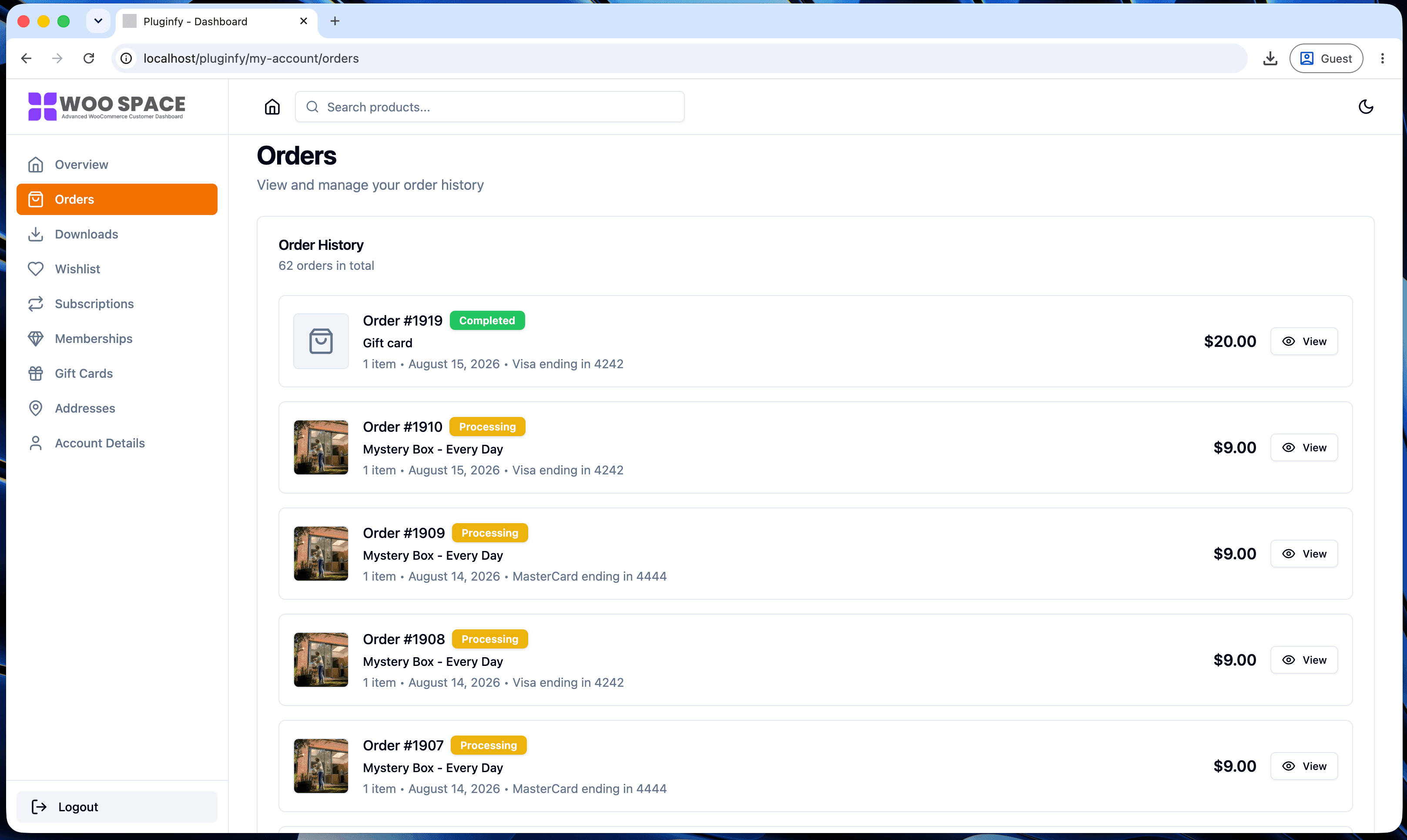
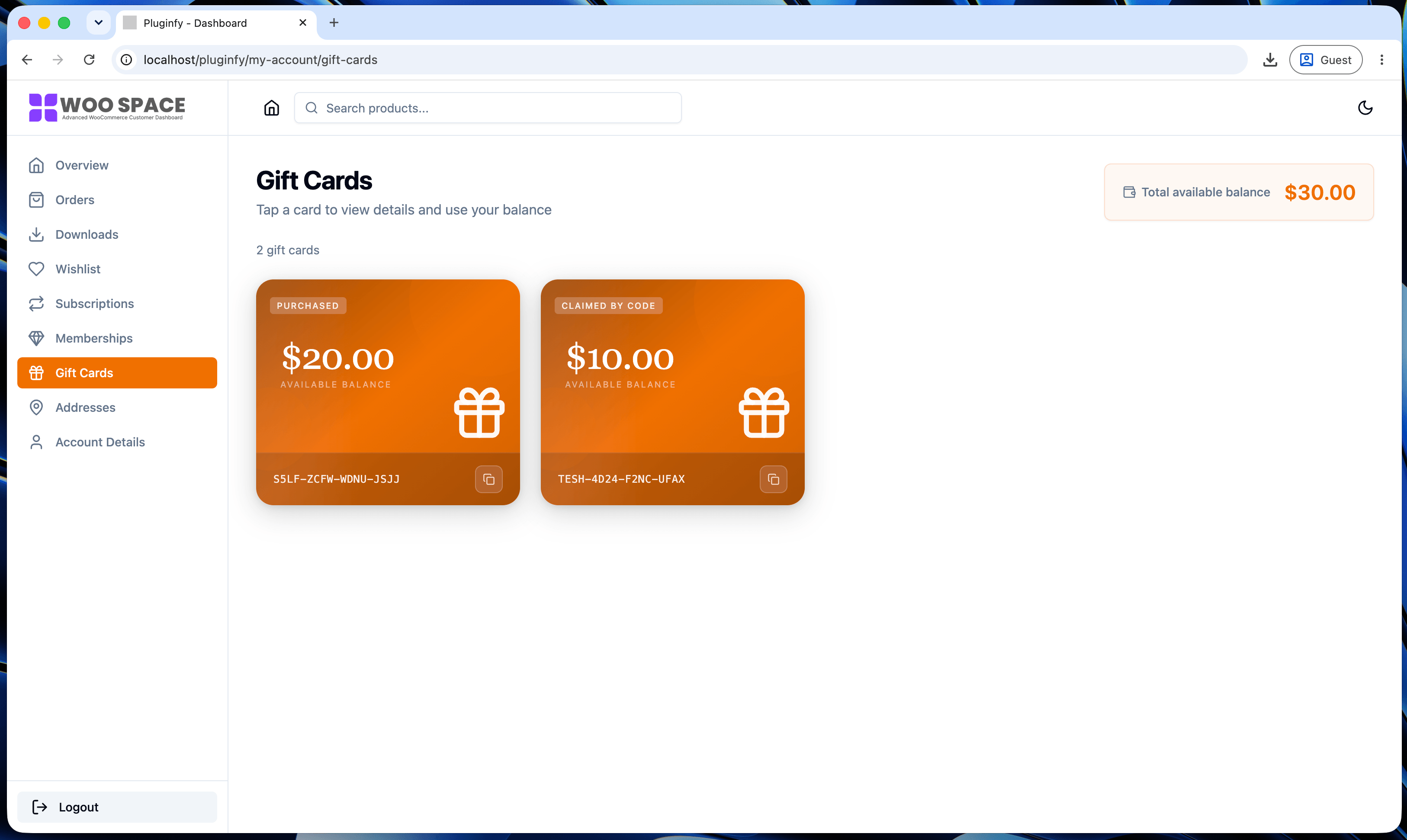
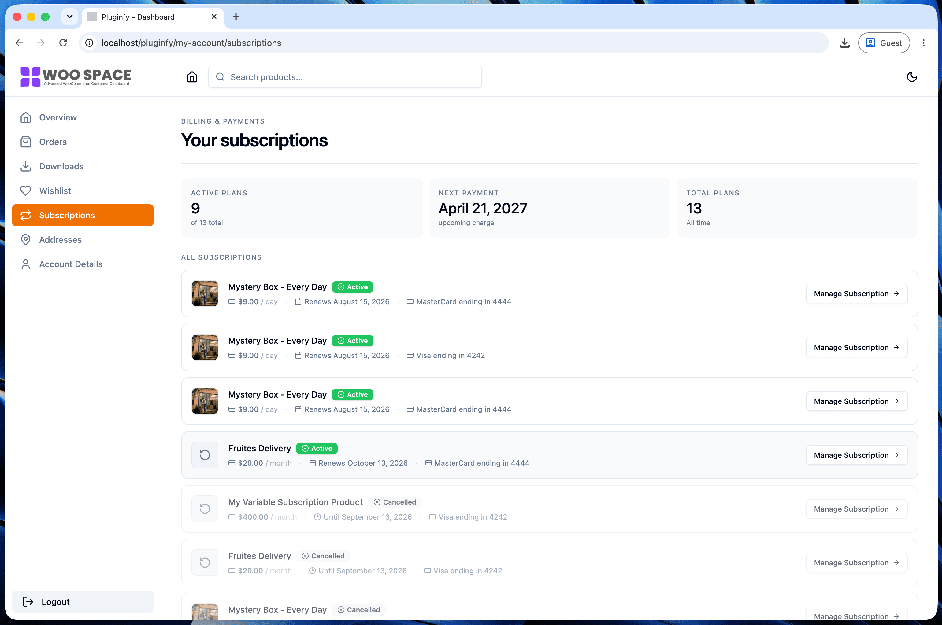
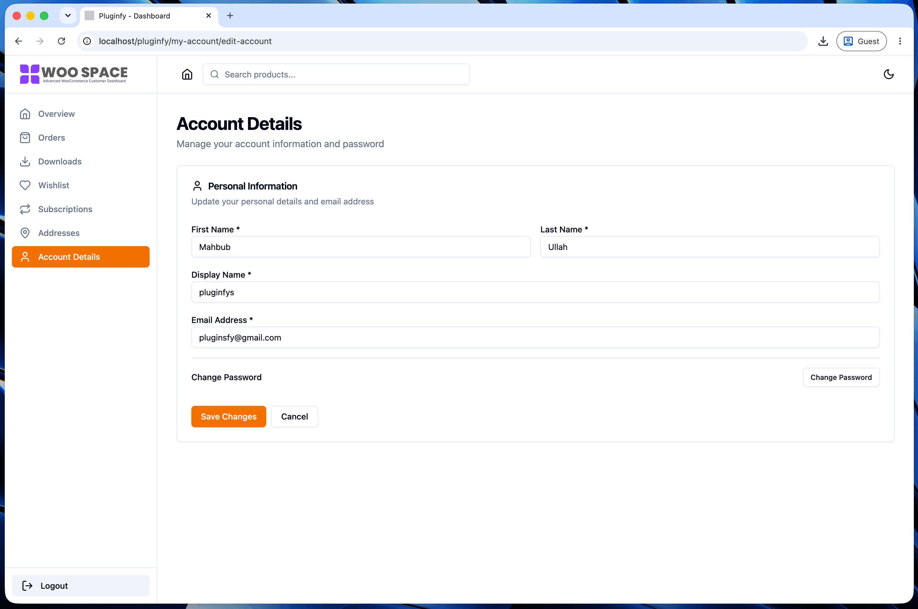
If you're hitting that wall, NextDash ships the end state of this entire post - rounded card navigation, mobile-friendly order cards, styled forms, and a real dark mode with a manual toggle - as defaults, configured from a settings screen instead of a stylesheet.
FAQ
Will my custom CSS survive a WooCommerce update? Yes - CSS in the Additional CSS panel or a child theme is never touched by WooCommerce updates, since you're not modifying any file WooCommerce owns.
Can I use CSS to reorder the navigation menu?
Only within limits - flex/grid order can visually reorder items
without changing their DOM position, but it's fragile and doesn't affect
screen readers or tab order. For a real reorder, use the
woocommerce_account_menu_items filter from our customization
guide instead.
Do I need !important to override WooCommerce's default styles?
Usually not - WooCommerce's own CSS is low-specificity by design so
themes can override it easily. If you find yourself reaching for
!important, double-check your selector is targeting the right element
first; it's rarely actually necessary.
Skip the custom code — install NextDash
NextDash replaces the default WooCommerce My Account page with a modern React dashboard out of the box: order management, downloads, addresses, dark mode, and fast client-side navigation, no template overrides required.